Tutorial: How to read a forest plot
Posted on 11th July 2016 by Nathan Cantley

As we get towards the top of the evidence-based medicine pyramid, strange looking graphs sometimes emerge. The forest plot is a key way researchers can summarise data from multiple papers in a single image. [If you have difficulty reading the text in any of the figures, clicking on the image will enlarge it].
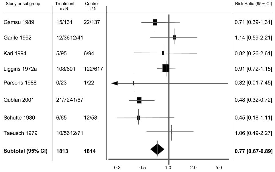
Figure 1. An example of a forest plot. Image adapted from Table 4 Roberts et al. (2006). [1]
Tutorial information
Learning Objectives.
By the end of this tutorial you should be able to:
- Understand what forest plots are used for
- Understand how to read a forest plot and what the results displayed mean both at the level of individual studies and the averaged result
- Understand why forest plots look different depending on the statistics being analysed
- Understand the importance of heterogeneity within forest plots and how it affects interpretation
Time to complete tutorial: 20-30 minutes
Example questions: Yes
References all open access: Yes
So why make a forest plot in the first place?
Trying to look at lots and lots of different papers that ask the same question can be difficult. This is especially true if the papers analysed come to different conclusions and have different statistics either in favour or against an association.
What a forest plot does, is take all the relevant studies asking the same question, identifies a common statistic in said papers and displays them on a single set of axis. Doing this allows you to compare directly what the studies show and the quality of that result all in one place.
Analysing the forest plot: the basics
Part 1: The axis.
Throughout this tutorial we will take Figure 1 (shown above), a forest plot from a Cochrane systematic review, as an example. As we go through the tutorial we will build Figure 1 up from first principles. I will reveal the significance of this particular forest plot at the end of the blog!
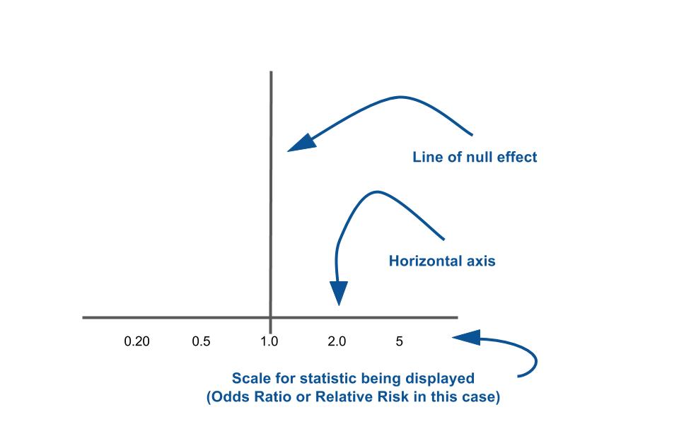
Figure 2. Let’s take this from the beginning.
What you see to the left is the basic set of axes that forest plots employ. The horizontal axis usually represents the statistic the studies being profiled show. This could either be a ‘relative’ statistic like an odds ratio (OR) or a relative risk (RR). Or the statistics being used might be an ‘absolute’ one such as Absolute Risk Reduction (ARR) or Standardised Mean Difference (SMD). Knowing the difference between relative and absolute statistics is important because it affects which number sits at the vertical line.
The vertical line is known as the “line of null effect.” This line is placed at the value where (as the title suggests) there is no association between an exposure and outcome or no difference between two interventions. If you remember from your statistics classes, relative statistics like OR or RR have a null effect value of 1. For absolute statistics like Absolute Risk or ARR or SMD, the null difference value is 0. Hence why the value at the line of no effect is relevant to the statistic being used. If you want a refresher about relative and absolute statistics why not check up on this S4BE blog.
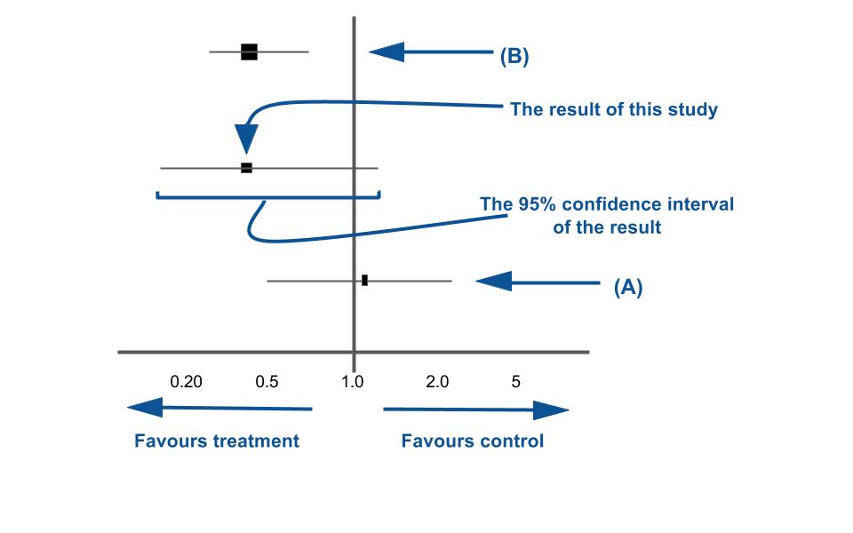
Figure 3. Let’s put some lines on these axis.
Part 2: The study lines.
Ok, so now that we understand the axes of the forest plot, let’s put some values on. Each horizontal line put onto a forest plot represents a separate study being analysed. In Figure 3, three studies are represented. Each study ‘result’ has two components to it:
- A point estimate of the study result represented by a black box. This black box also gives a representation of the size of the study. The bigger the box, the more participants in the study.
- A horizontal line representing the 95% confidence intervals of the study result, with each end of the line representing the boundaries of the confidence interval.
What each side of the null effect line represents (i.e. if it favours the control or the intervention) is also important when looking at the individual studies. This will be different depending on what question you are asking in your studies. For example if you are looking at the risk between an exposure and an outcome, what each side of the vertical line represents will be different to an instance where you are comparing an intervention with a control. Helpfully, for most forest plots published today, the authors helpfully mark what each side of the line represents. If it isn’t marked, remember to always go back to your first principles of the statistic you are using.
The horizontal line and whether it crosses the “line of null effect” is particularly important to take note of for each study. If you remember, the incredibly basic definition of the 95% confidence interval is: “The range of values within which you can be 95% certain the true value lies.” If the horizontal line crosses the line of null effect what that is effectively saying is that the null value lies within your confidence interval and hence could be the true value. If I were breaking this down to its most simplest explanation: “any study line which crosses the line of null effect does not illustrate a statistically significant result.”
There is one more component to the line which is useful to take note of. Whilst it is not guaranteed, as a rule of thumb the studies with a greater number of participants or patients typically have a narrower confidence interval and hence a smaller horizontal line. So in basic terms:
- The bigger the study, the smaller the horizontal line and bigger the black box representing the point estimate. This can mean it is less likely those studies will cross the line of null effect. Why? Because your 95% confidence intervals should have a much smaller range.
- The smaller the study, the wider the horizontal line and smaller the black box representing the point estimate. This means it is more likely those studies will cross the line of null effect (because your 95% confidence intervals will be much bigger).
Now you have read through the above description, have a look at Study (A) and Study (B) on Figure 3. Have a go at interpreting what each study is telling you before looking to the bottom of the webpage for the answer.
Part 3: Combining all the studies of the forest plot.
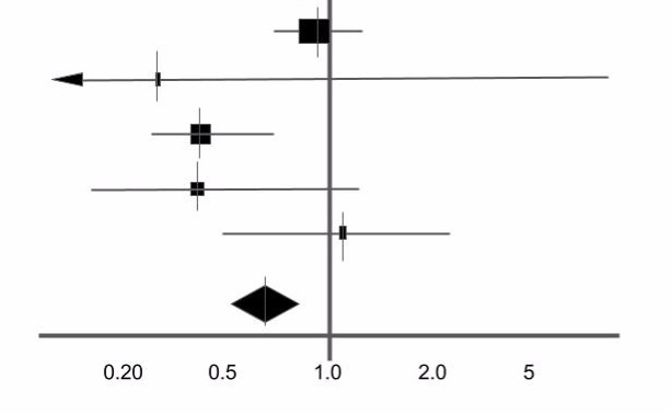
Figure 4. The Diamond of the bunch.
Figure 4 adds two more studies at the top (have a go at interpreting them) as well as a diamond. Now, the diamond is probably the most important thing you will see on a forest plot.
The diamond represents the point estimate and confidence intervals when you combine and average all the individual studies together. If you drew a vertical line through the vertical points of the diamond, that represents the point estimate of the averaged studies. The horizontal points of the diamond represent the 95% confidence interval of this combined point estimate. If you remember what I said in part 2 about the size of the confidence intervals- because this combined value effectively groups all the participants from all the individual studies, the CI range for this result should be the smallest on the forest plot (and in 99% of cases it normally is).
The rules about crossing the line of null effect are still true here: if the horizontal tips of the diamond cross the vertical line, the combined result is potentially not statistically significant. Why? If you remember, if the 95% confidence interval contains the null value, you cannot be certain that the null value isn’t the true value.
Part 4: Bringing it all together.
So we have talked about a number of the elements of the forest plot itself. Let’s have a bit of a look at all the “bumf” so to speak that sits around the forest plot on the graph. Let’s go back to our original image. Figures 5-8 highlight different elements on the forest plot that are worth noting.
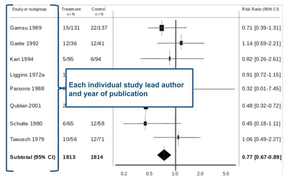
Figure 5. There is a wealth of information aside from the plot itself.
In Figure 5- to the far left of the forest plot is the name of the lead author for each individual study as well as the year of publication.
To the immediate left of the forest plot, are two columns of numbers- highlighted in Figure 6. Each column of numbers has two numbers separated by a ‘/’. If you look at the heading of each column you will see the numbers are organised as “n/N.” What does this mean? Put simply, ‘n’ denotes the number of patients or individuals which had the event/outcome in that particular group whilst ‘N’ denotes the total number of people in that group.
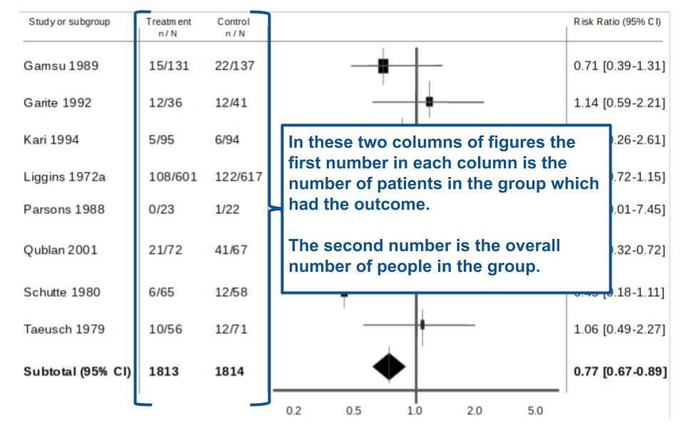
Figure 6. Makes sense when you compare the numbers to the graph.
So in our example paper we have two columns of numbers. The first column is for the group that received the treatment (n= number of treated people who had outcome, N= total number of people in study who got treatment). Whereas the second column is for the group that got the control (n= number of people in the control group who had outcome, N= total number of people who were in the control group).
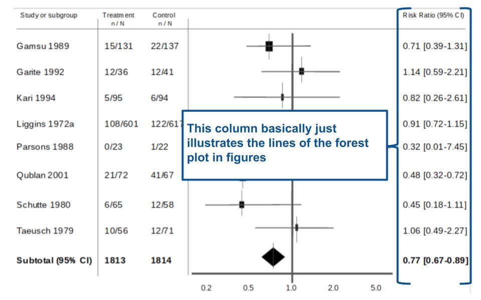
Figure 7. Sometimes it is just simpler to compare the numbers…
Figure 7 is on the other side of the forest plot. The far right column basically gives you the forest plot as numbers (both the point estimate and the 95% confidence interval in brackets). Some people might find it easier just to look straight to these numbers instead of looking at the plot and trying to interpret it.
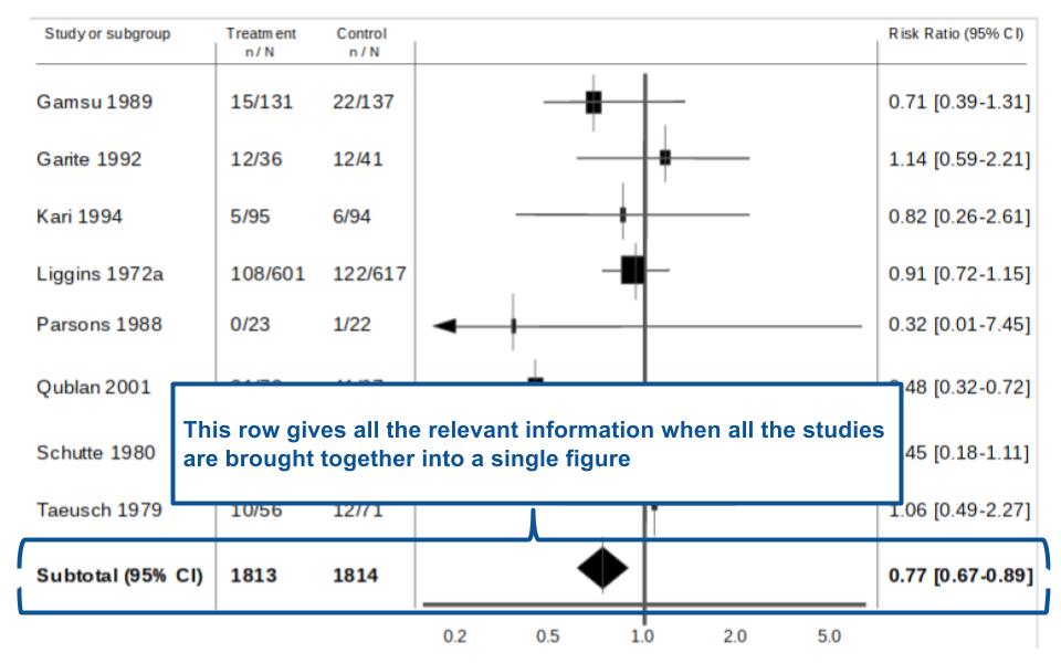
Figure 8. If it’s in bold- probably a reason for it!
Figure 8- This simply highlights the statistics associated with the diamond on the forest plot. The ‘subtotal’ is what it says on the tin. It tells you the total number of participants in the treatment and control groups across all the individual studies as well as the averaged statistic and 95% confidence interval. It’s useful to look at this line of numbers and the diamond when drawing conclusions for your meta-analysis/systematic review.
Part 5: Heterogeneity of the papers.
The final part of analysing a forest plot is about looking at something called ‘heterogeneity.’ Ideally, if different trials are testing the same thing, the effects of the intervention/exposure should be consistent across all the studies. Unfortunately, this is rarely the case. Many things can affect the results of a trial, such as researcher bias or problems with data collection [2].
So, in addition to analysing the study results, systematic reviews or meta-analyses are designed to ask a question. If these studies are all testing the same intervention, why don’t they get the same results? Are the differences caused by chance, or is there something else involved? If it is chance, then we have nothing to worry about. If the differences are not the result of chance, then we need to be cautious in how we interpret the results. To make it easy to assess the consistency of the papers analysed, a statistic called I2 is used (‘i-sqaured’).
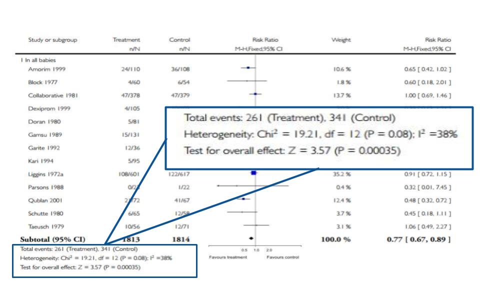
Figure 9. I spy with my little eye…something beginning with h…
As Figure 9 shows, the statistics related to heterogeneity are usually at the bottom of the chart. The rule of thumb is that you want the I2 to be less than 50%. Anything higher than that and the papers could be inconsistent due to some reason other than chance (which is bad!). For our example, thankfully, the I2 is 38%- not perfect but still within our target range. You will notice there are other statistics there like Chi2 and z. For the purposes of this tutorial, the I2 is the most useful in interpreting a forest plot.
Summary time
Hopefully, going through a forest plot from start to finish has helped you understand what makes forest plots tick. I would really encourage you to scroll to the top and look at Figure 1 which doesn’t have any annotations on it and work through the 5 steps we have gone through.
To summarise what we have covered:
- Each horizontal line on a forest plot represents an individual study with the result plotted as a box and the 95% confidence interval of the result displayed as the line.
- The implication of each study falling on one side of the vertical line or the other depends on the statistic being used.
- If the individual study crosses the vertical line, it means the null value lies within the 95% confidence interval. This implies the study result is in fact the null value and therefore the study did not observe a statistically significant difference between the treatment and control groups.
- The diamond at the bottom of the forest plot shows the result when all the individual studies are combined together and averaged. The horizontal points of the diamond are the limits of the 95% confidence intervals and are subject to the same interpretation as any of the other individual studies on the plot.
- The I2 statistic gives you an idea of the heterogeneity of the studies, i.e. how consistent they are. If the I2 value is >50% it might mean the studies are inconsistent due to a reason other than chance. This might make the conclusions you draw from the forest plot questionable.
Figure 10. Another forest plot from the same paper to work through. Image from Roberts et al. (2006) [1]
And finally…
Well, if you have ever seen the Cochrane Collaboration logo, you might recognise the horizontal lines and diamond.
That is because the Cochrane Collaboration logo is in fact the representation of a forest plot. The forest plot in the Cochrane Collaboration logo is from one of the first systematic reviews ever published [3]. The paper, published in 1991, showed that giving steroids to mothers whose babies were due to be born prematurely, reduced the complications of prematurity. The Cochrane Review which Figure 1 and 10 comes from is actually an update of that original review that went on to form the Cochrane Collaboration logo.
References:
[1] , . Antenatal corticosteroids for accelerating fetal lung maturation for women at risk of preterm birth. Cochrane Database of Systematic Reviews 2006, Issue 3. Art. No.: CD004454.
[2] “How to analyse the forest plot: Assess the Heterogeneity amongst the studies.” Centre for Evidence Based Intervention, University of Oxford. URL: http://www.cebi.ox.ac.uk/for-practitioners/what-is-good-evidence/how-to-interpret-the-sample-forest-plot.html#c56 Accessed: June 2016
[3] “Our logo: Cochrane Collaboration.” The Cochrane Collaboration, 2016. URL: http://www.cochrane.org/about-us/our-logo. Accessed: June 2016
Part 2 ANSWERS: DONT LOOK UNTIL YOU HAVE HAD A GO!
So, how did that go? What you should hopefully have found is:
- For study A- it has quite a wide horizontal line that crosses the line of null effect with a black box that is to the right of the vertical line. This most likely demonstrates a small scale study with few participants where the point estimate result favours the control used in the study. But because the study contains the null value in its 95% confidence interval, it is likely to have a p value >0.05 and not be statistically significant.
- For study B- it has quite a narrow line that does not cross the line of null effect with a black box that is to the left of the vertical line and is bigger than study A. This most likely demonstrates a larger study with more participants compared to study A, where the result favours the intervention used. Because the 95% confidence interval does not contain the null value, this study is likely to have a p value <0.05 and hence the differences observed in the study can be regarded as statistically significant.
The featured image in this blog has been retrieved from: en.wikipedia.org and is free to re-use.


No Comments on Tutorial: How to read a forest plot
Very useful.
24th January 2024 at 7:16 pmThank you. This was most useful. I’m ready for my FCOG final exam
30th October 2023 at 5:24 amIt’s very worthy indeed! I got confused in my advanced Epidemiology class about this but now is clear, thank you!!!
29th October 2023 at 3:03 pmThank you very much. It was quite useful.
16th October 2023 at 5:34 amvery well explained. Thank you for simplifying this!
12th September 2023 at 4:27 pmWhat does the height of the summary “diamond” at the bottom of the forest plot represent?
25th June 2023 at 2:44 amVery helpful and informative
26th May 2023 at 10:02 pmThanks!
Thank you so much for decoding the forest plot!!
27th April 2023 at 1:47 amThank you so much for breaking it down to this level. This was very helpful and comprehensive
27th November 2022 at 11:39 am