How to read a funnel plot
Posted on 27th June 2023 by Jehath Syed

What is a funnel plot?
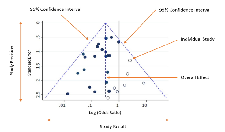
A funnel plot is a scatter plot that compares the precision (how close the estimated intervention effect size is to the true effect size) and results of individual studies. It is commonly used in meta-analyses to visually detect publication bias.
The term ‘funnel plot’ refers to the fact that the precision of the estimated intervention effect increases with the size of the study. Small study effect estimates will typically scatter more widely at the bottom of the graph, with the spread narrowing among larger studies as they are more precise and closer to the true effect.
How do you read a funnel plot?
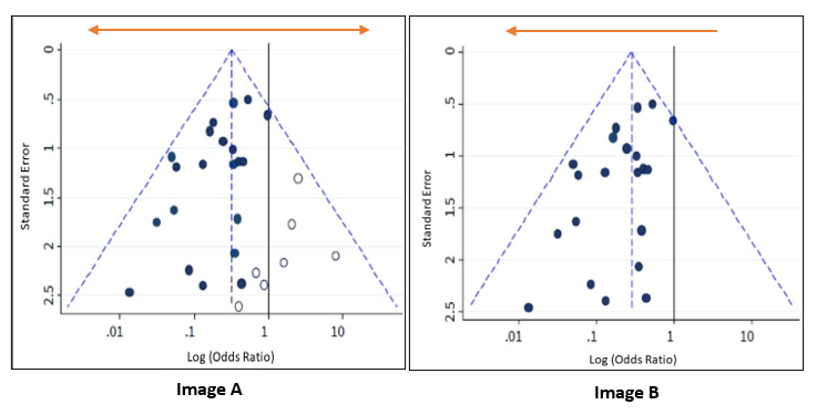
The plot should ideally look like a pyramid or a symmetrical inverted funnel, as seen in Image A.
- Each included study is represented as a dot.
- The y-axis represents a measure of study precision, with standard error being commonly used. Larger studies with greater precision are displayed at the top and studies with lower precision at the bottom. Other measures such as the reciprocal of the standard error, the reciprocal of the sample size, or variance of the estimated effect can also be used as the y-axis.
- The x-axis displays the study estimated effect size for an outcome. The scale for the x-axis can include risk ratios or odds ratios (which should be plotted on a logarithmic scale), or continuous measures such as mean difference or standardised mean difference.
- In the absence of both bias and heterogeneity, 95% of studies would be expected to lie within the diagonal dotted ‘95% Confidence Interval’ lines, as shown in Figure A.
As a rule of thumb, tests for funnel plot asymmetry should only be used when at least 10 studies are included in the meta-analysis, because the power of the tests is low when there are fewer studies.
What are you looking for?
Image A is shown again below alongside Image B, which depicts an asymmetrical funnel due to presence of bias (the points are now predominantly towards the left). In this case, the meta-analysis summary estimate will tend to overestimate the intervention effect. The greater the asymmetry, the greater the likelihood that the amount of bias in the meta-analysis will be significant.
Possible reasons for asymmetry in a funnel plot are:
- Non-reporting bias: Some studies, or specific results, are less likely to be published if they are not statistically significant, or if the effect size is very small or non-existent.
- Poor methodological quality leading to exaggerated effects: Studies with inferior methods may show larger effect estimates of an intervention than would have been observed in a well-designed study.
- True heterogeneity: Sometimes a significant benefit of an intervention can only be observed in patients who are at high risk for the outcome targeted by the intervention. These high-risk patients are more likely to be included in small, early trials, leading to asymmetry in the funnel plot.
- Artefactual: Certain effect estimates, such as odds ratios or standardised mean differences, are inherently correlated with their standard errors. This correlation can create a false asymmetry in a funnel plot even when there is no bias.
- Chance: With a small number of studies and their heterogeneity (variation), the analysis of the relationships between studies in a meta-analysis is more prone to false positives. This can affect the symmetry of the funnel plot.
References (pdf)
You may also be interested in the following resources related to this topic:
- Medical Statistics X: Funnel Plots (Rob Radcliffe, School of Surgery) – YouTube video (9 minutes)
- Catalogue of Bias from the Centre of Evidence Based Medicine, Oxford (website)
- Funnel plots in meta-analysis (pdf) (paper)
- A beginner’s guide to interpreting odds ratios, confidence intervals and p-values (blog)


